Wednesday 25 March 2015

Glitter

For my final section of these shoots, I added glitter on top of the models make-up. 


The sun had begun to set by this point in the shoot, so the brightness of these photos has been increased so they don't appear duller than the other shoots. 

Due to the sun setting, this final section required me to use artificial lighting, which reflected off the glitter more effectively than the natural sunlight would have. These photos haven't been edited as the lighting did all the work for me.


Paint

As the make-up became more unconventional, as did the poses. I liked the silliness of the middle two photos as they add fun to the photos. 


I liked the colouring of this shoot as the overall pastel shades are easy on the eye and create very 'pretty' photographs.

Pink

The outcome of this shoot was more disappointing, but the two shots I have included were ones I was satisfied with. The colouring of the make-up was difficult as they could easily look like bruises. However, the inclusion of the lipstick tied the colours together and made the eye-shadow look more deliberated. 
Interestingly the eye-shadow could be construed as bruises, and the pose of the model reflects that; the lack of eye contact with the camera paired with the self-concious downward tilt of the head implies nerves or shame. 


Make-up 1

These photos were inspired by both Rankin and Testino as is seen by the use of pastel coloured stripes and spots. I prefer the photos with the pale blue background as the colour of the make-up matches the background and it has a cool tone to it. Having the model look away from the camera also creates a sense of fantasy, as if she's in her own world. 
Again, the editing for these photos was very basic as the natural lighting was flattering and left little need for much alteration.


Basic Portraiture to Edit

Instead of manipulating the portraiture before the press of the shutter, either through make-up and lighting, I decided to experiment with the photo itself. I took a number of standard portrait shots of my model, with the intention of editing them afterwards. For these photographs I will change them both physically and with Photoshop,
I didn't edit these photos much more than simply brightening them by a fraction, as they didn't really require it. I will suspend these in liquid, and photograph them, and also experiment with layering on Photoshop, much like the Wonderland photographs.


Piss Christ - Andres Serrano

'Piss Christ’ by American artist and photographer Andres Serrano was taken in 1987 and depicts a crucifix suspended in a glass of the artist’s own urine. At the time it was extremely controversial due to the blasphemous nature of the photograph, and was even attacked with a hammer by two teenagers in 1997. The overall colour is an orange glow and the photograph is taken from slightly below the crucifix, almost as if you were looking up at it. The scale of the photo isn't clear at a first glance, without knowledge of the context, and initially I believed it to be a full scale crucifix in the ocean. Once the viewer becomes aware that it is actually suspended in urine, the reaction completely changes. Andres Serrano was raised a very strict Catholic, and for Catholicism this piece of work would be considered extremely offensive. However, Serrano, who is now a Christian, has claimed that this work was more of a commentary on the state of the church and humanities attitude towards the sacred nature of the cross.

Sunday 15 March 2015

Mario Testino - Paint

These photograph's of Cara Delevingne were for Allure magazine and feature her drenched in foundation. All of the focus is on her face, with her body and the background being out of focus. The composition is central, which works of this type of portrait as the viewers eye is drawn straight to the middle of her face, where the drama is. The foundation is the same colour as her face, so it's not immediately obvious why this photo is unusual as it blends in. This makes an interesting contrast to Rankin's use of bright colours. As Cara is naked, there is no disruption of the illusion caused by clothing, which makes the photo easier on the eye. 

Mario Testino - Hair and Make-up

Mario Testino is a fashion photographer from Peru who's work largely features in fashion magazines such as Vogue and Vanity Fair. Here Testino has used make-up, colouring and background to make these portraits appear unusual. The lighting used is studio lighting, and there are hardly any shadows cast on the model's faces. This almost makes them appear two-dimensional, but the colour of the eye-shadow adds some contour. The flowers around the edge have been photoshopped in to replace any background and to take up the negative space, framing the models with more colour. The hair of the models has also been coloured making it appear almost psychedelic.

Wednesday 11 March 2015

Make-up Pre-shoot 2


Make-up Pre-shoot

For this shoot, I used myself as a model as I was the only one available. This served as both a learning curve and a hinderence as using yourself as a model means composition and posing becomes a lot more difficult. This shoot was inspired by Rankin's make-up shoot, which is why I chose the background and make-up to imitate one another. It is a lucky coincidence that my hair and my eyes also match because it creates a running thread throughout the photo.


Tuesday 10 March 2015

Paper Pre-shoot

I initially used a green piece of card for this shoot, but it clashed unflatteringly with the models skin tone, making it appear too red, so the photos I picked are the ones with the blue card. I used a lightning bolt, inspired by Rankin's photo, but I used a coloured card instead to see if it changed the effect of the photo. It definitely has less of a minimalistic feel than the white card did.


These photo's have very little editing done to them as I didn't feel they needed them, In hindsight, I would have edited out the shadow you can see across the paper in the second photo, as it spoils the effect slightly.

Rankin - Make-up


Here, Rankin has used colour and make-up to make these portraits unusual. In the photo above, the eye make-up is the same colour as the background, creating a relationship with the model and her background, which is unusual as usually photographers separate the two elements using contrast. The lighting is very artificial, as is seen in the reflection of the models eyes, but without flushing the colour out, and we can still see even the lightest dots on her face. There is a small depth of field as the model's nose is in focus, but her ear is not, meaning all the focus is intended to be on the models face. The off-centre composition suggests a more thoughtful approach, as to have the model directly central may appear thoughtless. In landscape photographs it is easier to experiment with composition as you have that space either side of the models face. The colours are bright and almost garish, creating a candyland feel. I'd be interested in replicating this flavour of shoot, with the pastel colours and bright make-up.

Rankin - Paper


Rankin is a fashion photographer who founded magazines such as HUNGER and Dazed and Confused. Rankin has used a piece of card as a viewfinder to display only a fraction of the models face. The block colour of the paper creates a minimalist style frame for the eye and it almost seems as if the photo is lightning shaped. The use of make-up makes the view through the paper more dramatic and draws attention to the eye. It reflects the 1970's David Bowie-esque glam rock era, the use of a lightning bolt reminiscent of Ziggy Stardust's famous make-up. Rankin has used studio lighting to illuminate this photo, as is evident by the shadows cast on the models face and the reflection in her eye.


Friday 6 March 2015

Gel Pre-shoot - Colours

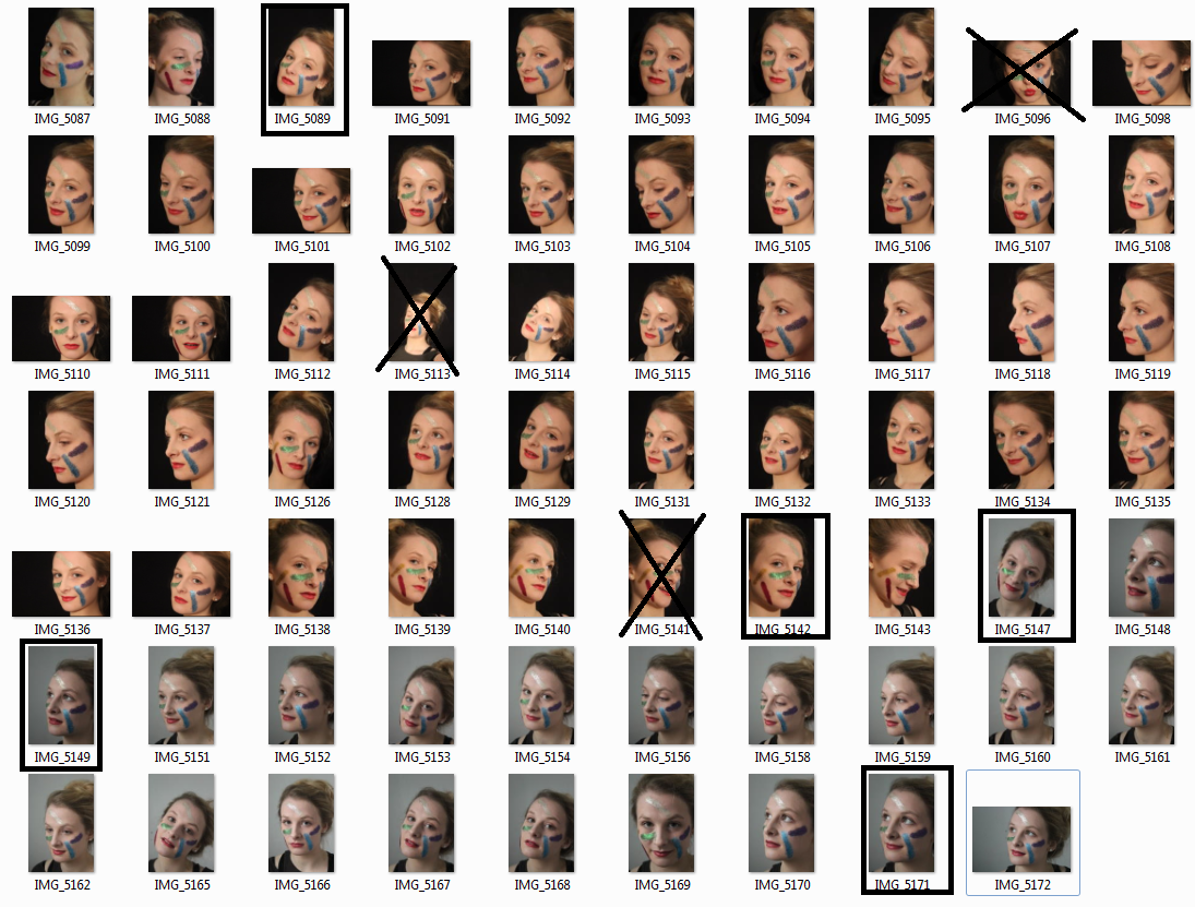
For this second shoot, I wanted to focus more on the editing. I only used one filter for this shoot, as I really liked the way the red looked in my previous pre-shoot. I didn't worry too much about how the colour looked in these photos as I was going to edit them afterwards. I again used a black background for that contrast. 

To change the colour, I used the 'adjust hue' setting on Photoshop to completely change how the colour appears. I experimented with a lot of colours in this way, and below are the results.


Some of these photos appear slightly too bright which is something I'd change if I were to do this again. I like the colour purple and blue, as they are complete opposites of what the face normally looks like.